
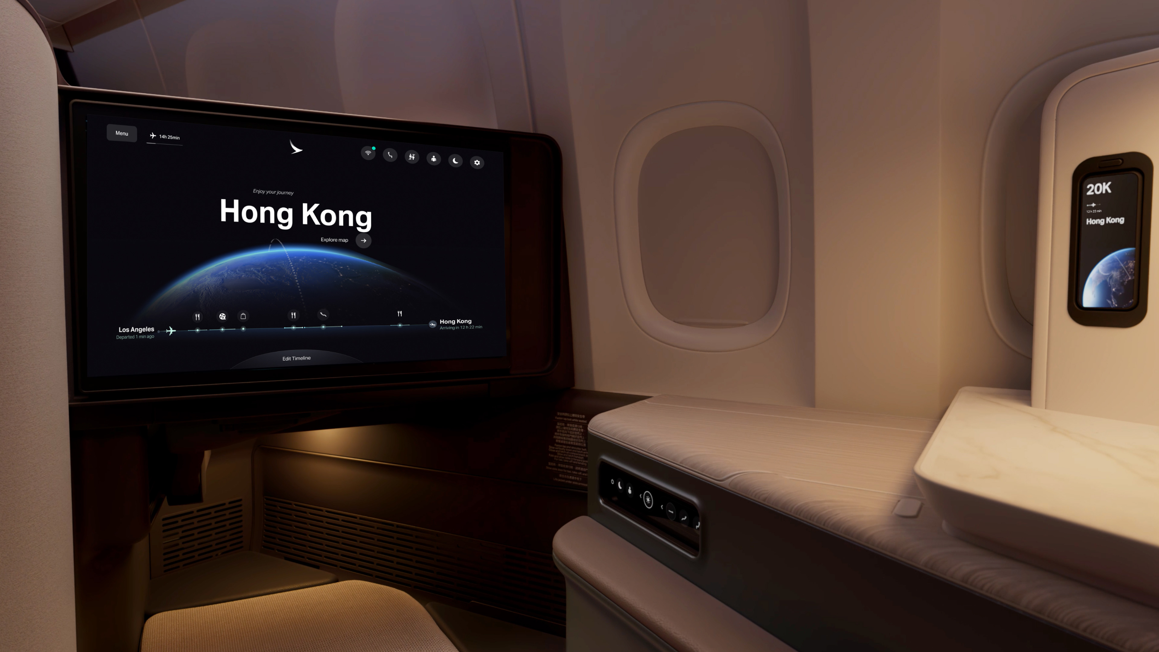
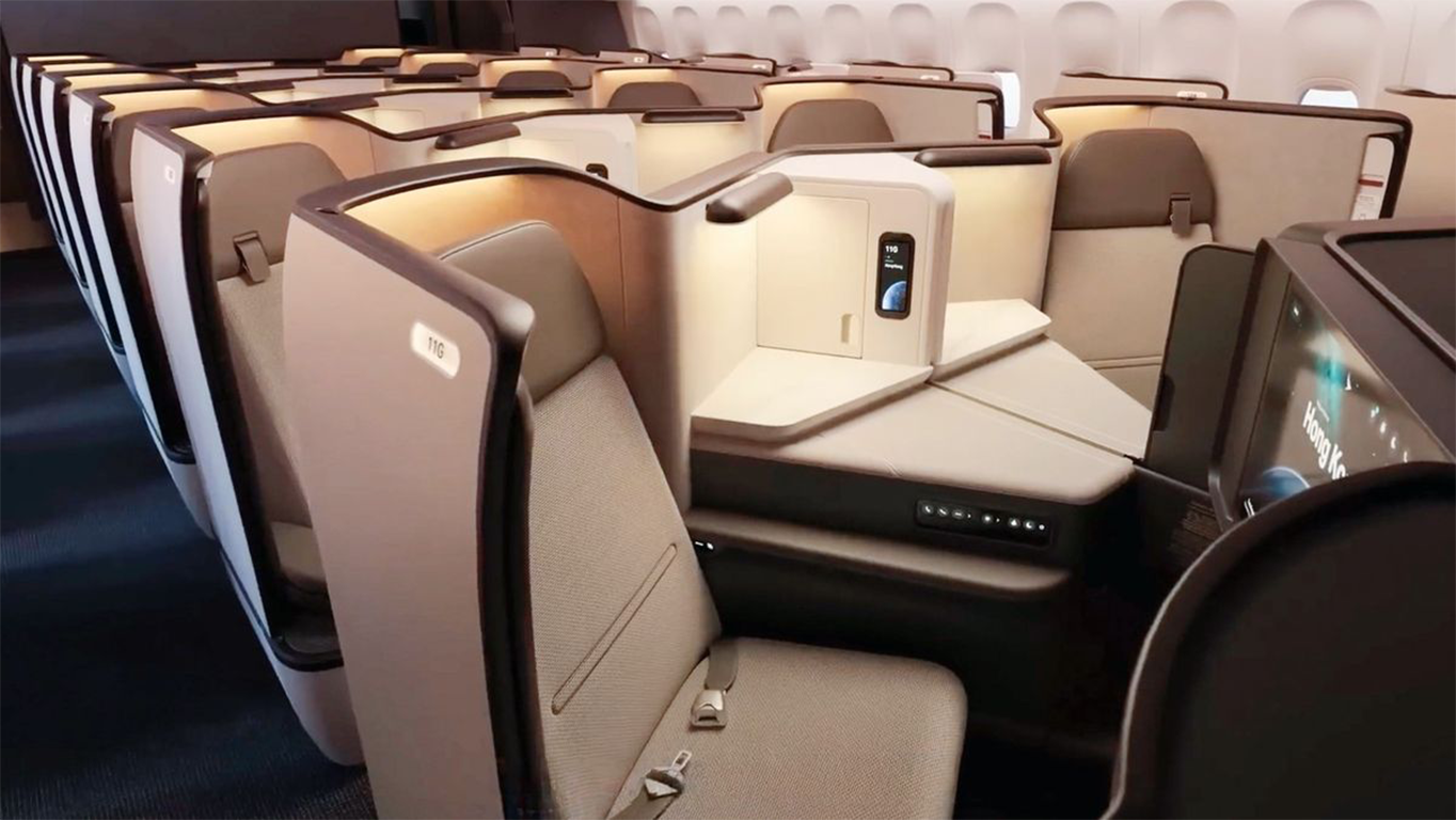
Airbus A350, Airbus A321, Boeing 777 and brand new fleet. Supported by an ambitious scope of over 500 tailored designs, ensuring robust consistency and superior engagement across the entire fleet.
Cathay Pacific is a Hong Kong-based international airline known for its deep commitment to premium service quality. Founded in 1946, the airline has grown to become one of the world's leading airlines, often celebrated for its excellence in service, safety, and passenger satisfaction. Cathay Pacific operates a sophisticated fleet that includes a wide variety of aircraft types, serving over destinations around the globe with a strong presence in Asia, North America, Europe, and Australia. t to all aircraft.
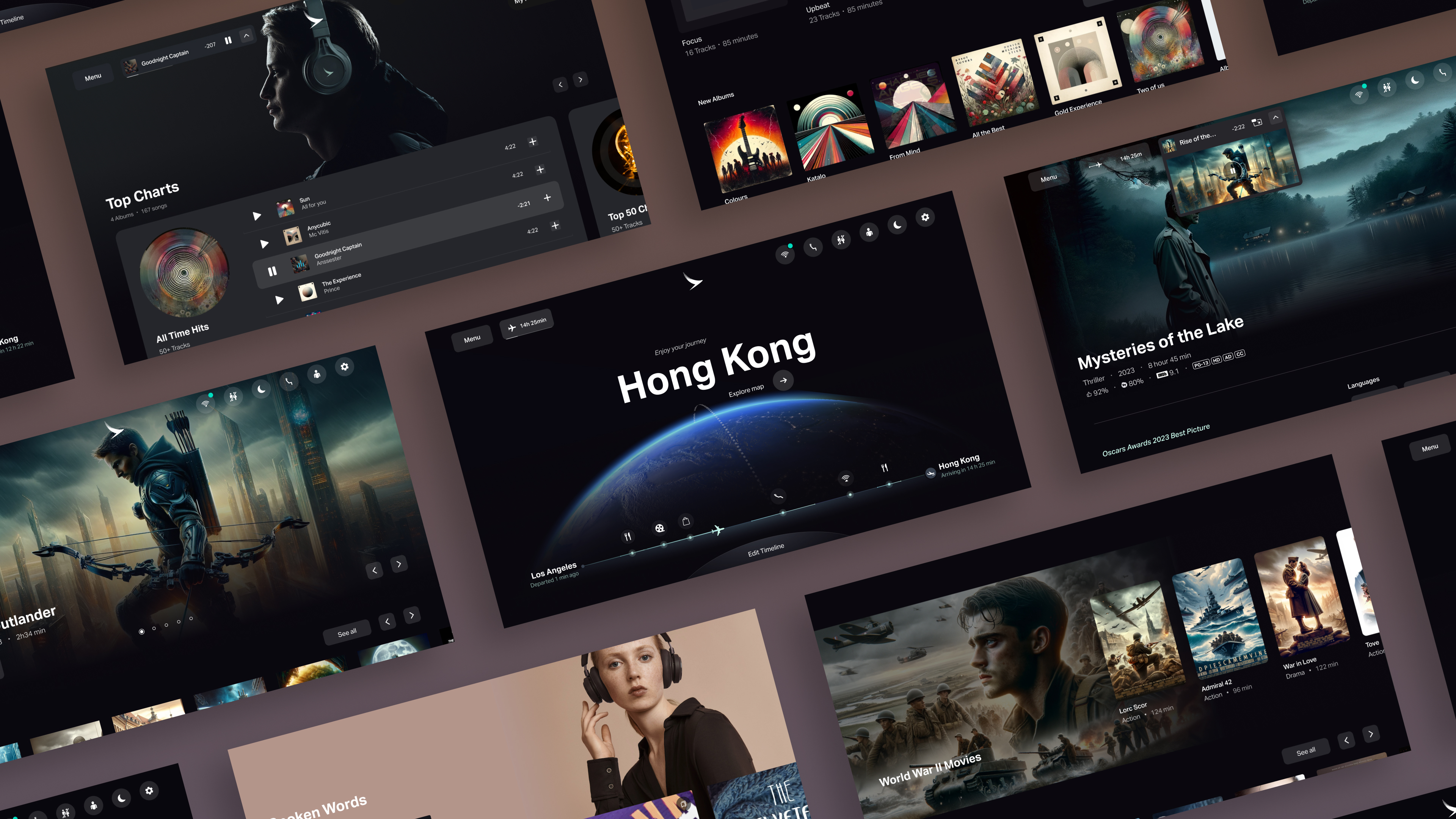
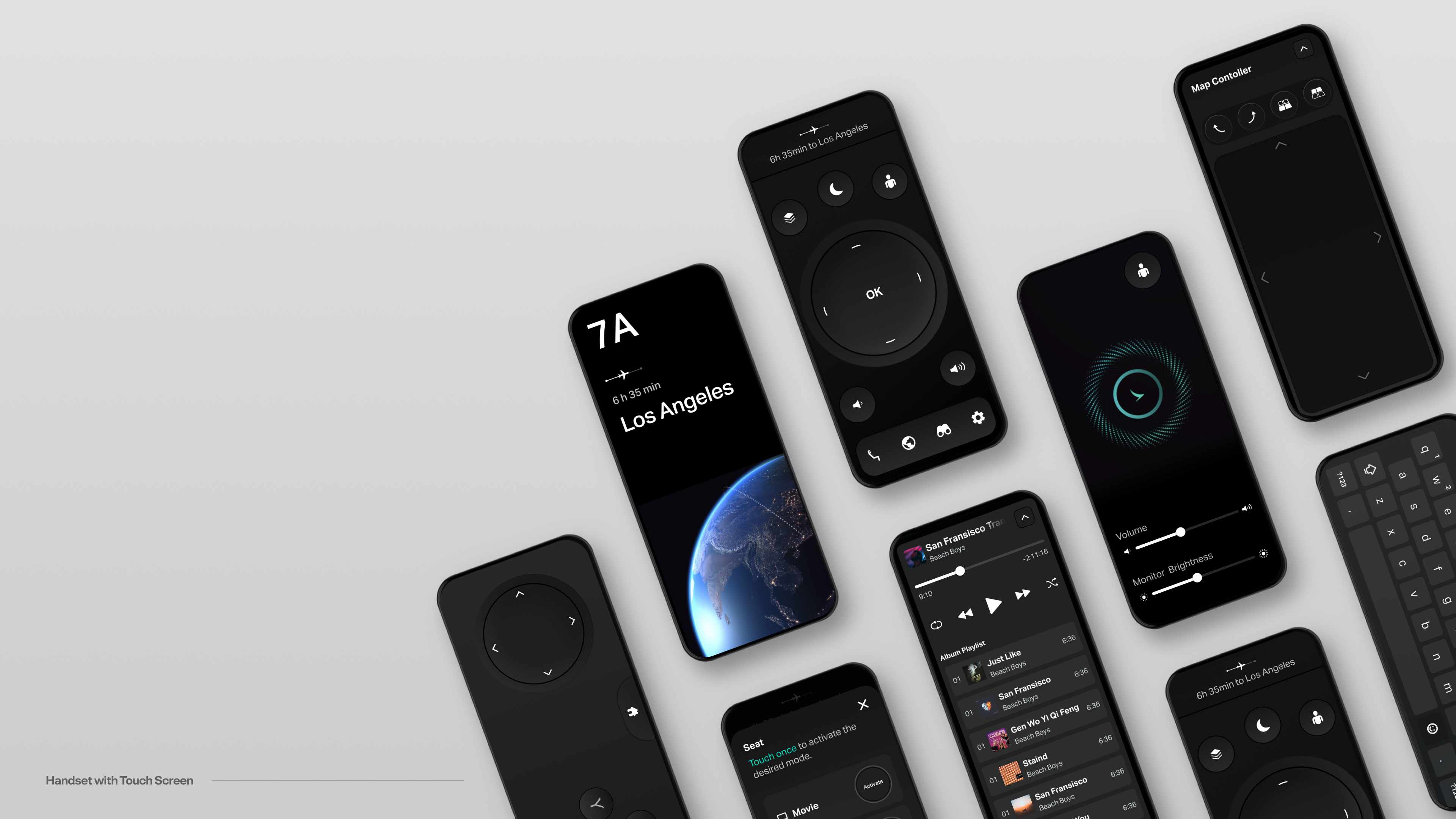
At the core of our framework lies the Seatback design, serving as the nexus for our aesthetic and functional guidelines.
This central hub harmonizes elements such as color palettes, typographic hierarchies, motion dynamics, and spatial alignment, whalso housing our meticulously defined design tokens.
Additionally, it encompasses comprehensive standards for copywriting and accessibility to ensure universal usability and cohesive visual flow.
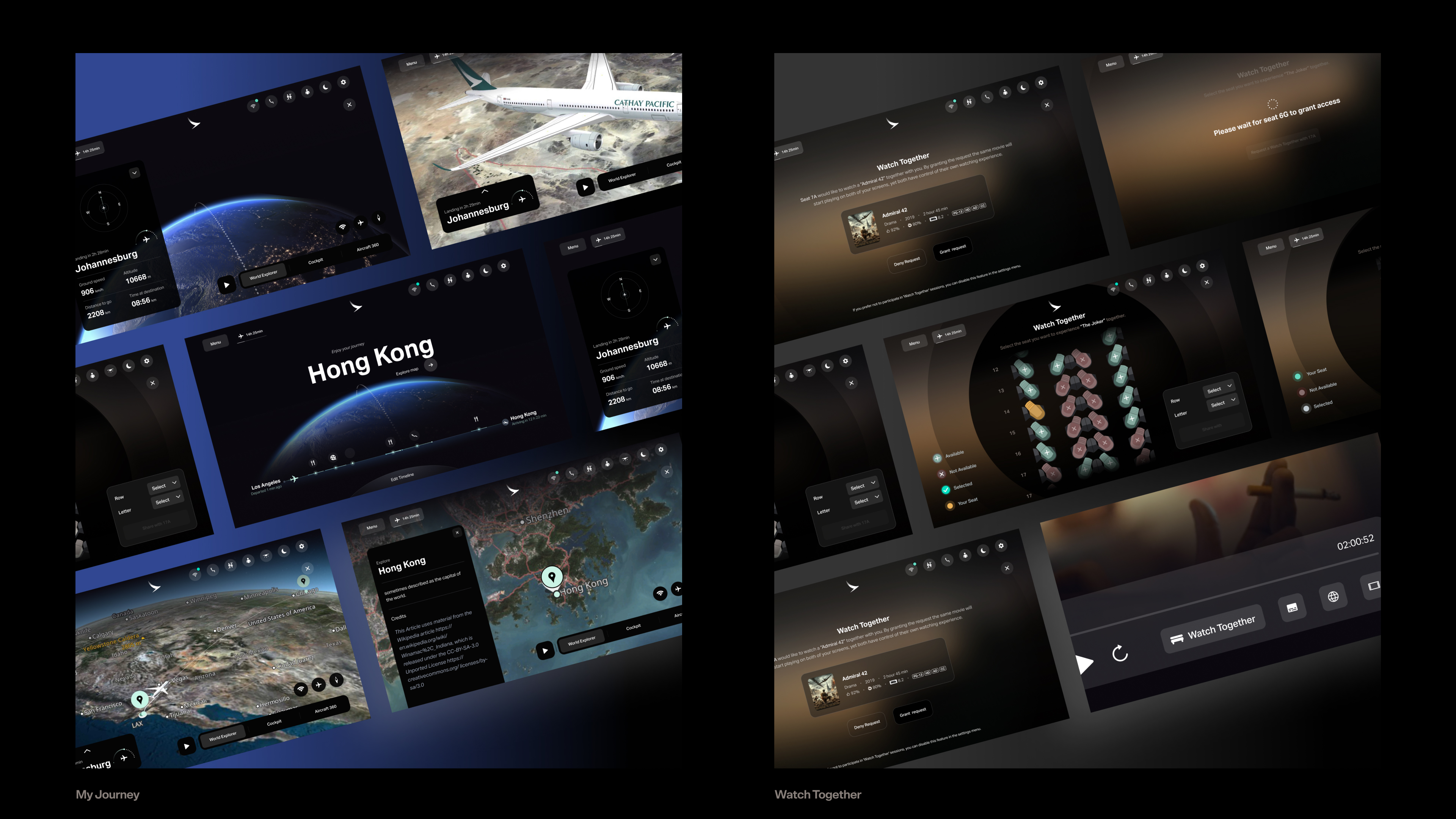
In our design strategy, we prioritized the creation of an interface that transcends generational boundaries, ensuring that it is intuitively user-friendly for a diverse age range from children to the elderly..
Ideally, we would present this with segmented user analysis data by generation; however, such demographic specifics are unfortunately not applicable in the airline industry.
This inclusive design philosophy involves simplifying access to an extensive array of content while maintaining a high degree of engagement across all demographics. By implementing user-centric design principles, we have significantly enhanced the usability of our In-Flight Entertainment (IFE) system. Our approach optimizes user interaction with the interface also makes substantial improvements in how content is accessed and enjoyed by passengers.
The result is a profoundly integrated component of the travel experience that is thoughtfully tailored to meet the needs and preferences of every passenger, irrespective of age, thereby promoting a universally accessible and satisfying journey. This commitment to inclusive design not only fosters greater engagement but also reinforces the usability of our IFE system as a key element of the modern air travel ecosystem.
During the development phase of our designs, we adhered to the stringent testing protocols typical
in aviation, conducting extensive and continuous user testing as a core component of our strategy.
This ensured the highest standards of usability and satisfaction. The tests were performed
iteratively at various stages of the design process, allowing us to capture real-time feedback from a
diverse range of users and maintain the rigorous quality expected in the aviation industry.
•Iterative Testing and Feedback Integration:
• Continuous User Engagement: Structured testing sessions frequently conducted to gather in-depth user
feedback, mirroring the detailed and exhaustive testing protocols prevalent in aviation.
• Dynamic Design Adaptation: Feedback was swiftly incorporated into the design process, enhancing
interface flexibility and responsiveness.
•Focused Design Modifications:
• User-Centric Philosophy: Designs are continually refined based on direct user feedback, ensuring they are
perfectly aligned with user behaviors and expectations.
• Optimized Interaction Models: Modifications aimed at reducing cognitive load and improving the flow of
interactions, thereby increasing the visual and functional appeal of the interfaces.
•Reliability and Performance:
• Aviation-Grade Testing Rigor: Reliability and performance tests are conducted with the same
thoroughness as expected in aviation, ensuring the IFE systems meet the highest operational standards.
•Outcome:
• Precision in Meeting User Needs: Systematic integration of user feedback and adaptive design tactics
lead to sophisticated, user-friendly interfaces that reflect contemporary usability standards and uphold
the rigorous testing culture of the aviation industry.
In designing micromotions and animations for the UI, we focused on ensuring they remain engaging even after repeated views—a key consideration given that passengers might encounter the same animations up to a thousand times. Imagine the diminishing impact of seeing an animation repeatedly; to counter this, we adopted a smooth approach inspired by elements of aviation itself.
For example, the cabin announcement animation draws from the motion of airplane engines, while the landing animation is inspired by the rotating flight information display boards found in airports. This strategy helps maintain a sense of freshness and continuous engagement, ensuring that every interaction feels new and interesting.
In our In-Flight Entertainment (IFE) system, we prioritize readability and accessibility through the strategic use of high contrast color schemes. By employing a stark contrast of dark and light colors, we ensure that all elements within the interface are as legible as possible. This design choice enhances user experience meets stringent accessibility standards, achieving a contrast ratio of 19:1. This ratio significantly exceeds industry requirements, guaranteeing that text and interactive elements are easily distinguishable for all users, including those with visual impairments, thereby facilitating easier navigation and a more inclusive user experience.


